Collected Home
How to Display Collections Without Looking Cluttered
A full shelf does not have to feel chaotic. Use clear boundaries, focal pieces, grouping, varied height and small areas of visual rest to make a collection easier to see and enjoy.
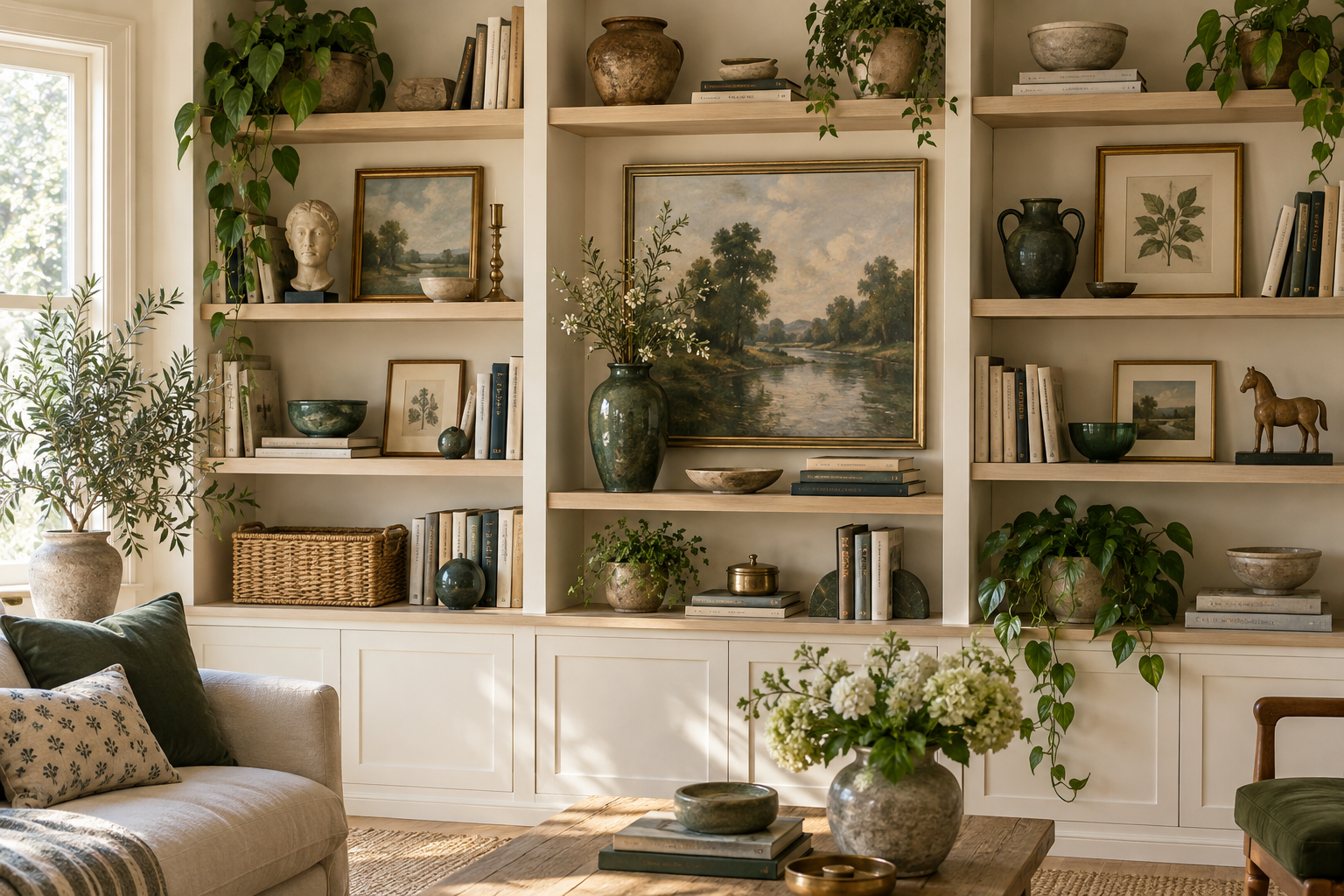
A collection can contain beautiful, meaningful objects and still become difficult to see.
The problem often appears when every piece is displayed with the same visual weight.
Small objects are spread evenly across every surface. Books, frames, ceramics and souvenirs all compete for attention. A shelf becomes so tightly packed that removing one item means rearranging everything around it.
Nothing is necessarily unwanted.
The display simply needs more structure.
The goal is not to make the collection sparse.
It is to help the eye understand what it is looking at.
If the whole home feels crowded rather than just the display, start with Maximalist Home Organization: How to Make More Stuff Feel Intentional.
Why collections can look cluttered even when every object is loved
A display often feels chaotic for one of three reasons:
- there is no clear boundary
- every object is competing equally
- display objects are mixed with temporary everyday items
That means the solution is not automatically removing half the collection.
Start by clarifying where the display begins and ends, what deserves attention first, and what the surface still needs to do.
Give the display one clear boundary
A collection is easier to read when it has a defined territory.
That might be:
- one shelf
- one display cabinet
- one console
- one wall
- one section of a bookcase
- one tabletop
- one mantel
The boundary can be full.
It simply needs to be intentional.
For example, “the top two shelves belong to ceramics” creates more clarity than allowing pieces to spread across the bookcase, dining table, windowsill and kitchen counter.
A boundary also tells you when the issue is no longer styling.
If the collection keeps spreading beyond the space you chose for it, Collection or Clutter? can help you decide whether the collection needs a better system, a larger territory or a different relationship with the room.
Choose what the eye should notice first
Maximalist displays still need hierarchy.
Choose one focal piece or grouping.
This might be:
- the largest object
- the most colourful piece
- a meaningful artwork
- one sculptural item
- a group with strong visual presence
- an object positioned prominently
The focal point tells the eye where to begin.
Without one, twenty interesting objects can cancel one another out because everything is asking for the same amount of attention.
You do not need only one important object in the room.
You simply need a starting point within the display.
Let some pieces support rather than dominate
Once the focal piece is clear, choose supporting objects.
Supporting pieces strengthen the story without competing with the anchor.
For example:
A large ceramic vessel might be the focal point.
Two smaller vessels in related materials may support it.
Several books may add height and context.
A framed photograph may provide another layer without needing to dominate.
The supporting pieces still matter.
They simply have a different visual role.
Use background pieces for richness
Some objects are there to create density, rhythm or context.
These can become the background layer.
Background does not mean unimportant.
It means the objects do not need to be individually prominent.
A row of books may create the supporting visual field for a few displayed objects.
A group of smaller records, postcards or photographs may provide richness behind a stronger focal piece.
This is one of the ways a display can remain generous without becoming visually flat.
Leave a little visual rest
Rest is the fourth layer.
Rest does not mean an empty shelf.
It simply means an area where the eye is not being asked to process another focal point.
This may be:
- a small gap beside a grouping
- one quieter run of books
- a section with fewer small objects
- a little open surface around one larger piece
Maximalism needs contrast too.
If everything is equally prominent, nothing feels especially visible.
A little rest makes the fuller areas easier to appreciate.
Group small objects instead of scattering them
Several small objects often read more clearly as one intentional group than as separate pieces spread across a shelf.
For example:
Instead of placing six miniatures at equal intervals across a long surface, create two or three small groupings.
Instead of spreading travel souvenirs around five unrelated rooms, place a few together where their shared story becomes obvious.
Grouping helps the eye understand:
These objects belong together.
That is especially useful when individual pieces are small enough to disappear visually on their own.
Vary height so everything is not on one line
A shelf can feel static when every object sits at roughly the same height.
Use natural variation.
You might:
- place a smaller object on a short stack of books
- combine tall and low pieces
- lean a framed item behind a smaller object
- use the objects' existing scale differences
- use a restrained riser if it genuinely helps
The goal is not to create a complicated styling formula.
It is to avoid making the whole display one long horizontal row.
Height variation creates rhythm.
Repeat one visual connection
A collection does not need matching objects to feel cohesive.
Repeat one visual connection.
That could be:
- colour
- material
- shape
- era
- subject
- maker
- theme
For example, a shelf might contain books, ceramics and framed pieces that all repeat warm green tones.
Or several completely different objects may share brass details.
Or a travel collection may be united by one region or story.
Repetition gives the eye a reason to read separate objects as part of one whole.
Leave return space
A display should be maintainable.
Do not pack a shelf so tightly that removing one object leaves no practical way to return it.
This matters especially for collections you actually handle.
If taking out one record, book, camera or object requires dismantling the whole arrangement, the display will become harder to maintain over time.
Leave enough physical tolerance that things can move.
A little return space also helps when a new piece enters temporarily or when you rotate part of the display.
Keep access in mind
Display does not have to make objects untouchable.
Ask which pieces you actually use.
Frequently handled items should be accessible without:
- moving several fragile objects
- lifting heavy pieces
- dismantling a layered arrangement
- opening several containers
A display can be visually rich and still support real use.
If the collection is mostly decorative, access may matter less.
If the collection includes books, records, cameras, craft tools or other usable objects, access is part of good organization.
Protect the function of tables, mantels and consoles
A full surface can still look intentional when everything on it is there on purpose.
The problem begins when display and temporary accumulation merge.
Give the surface three possible jobs.
Display area
This is where intentional objects live.
For example:
- art
- books
- photographs
- candles
- ceramics
- plants
- collectibles
Function area
This is the part that must remain usable.
For example:
- putting down a drink
- opening mail
- writing
- preparing food
- getting dressed
- placing keys
Temporary landing
If objects regularly arrive “for now,” give them one small tray, basket or defined edge.
That distinction can make a full surface feel much clearer because the collection is no longer visually mixed with unresolved everyday items.
What if you own more than the display comfortably holds?
Do not force every valued object into the visible layer.
Some pieces can rotate.
That does not make them less important.
It simply gives the display enough space to be readable now while allowing more of the collection to return later.
Use How to Rotate a Collection Instead of Displaying Everything at Once when the issue is display capacity rather than whether you still value the pieces.
A simple curated-shelf reset
Choose one shelf.
Then:
1. Choose an anchor.
What should the eye notice first?
2. Group the small objects.
Which pieces make more sense together?
3. Vary the height.
Can books, object size or one restrained riser create rhythm?
4. Repeat something.
Is there one colour, material, shape or theme connecting the display?
5. Leave return space.
Can you remove and replace objects without rebuilding the shelf?
6. Check access.
Are frequently handled items still easy to reach?
Stop when the shelf feels easier to read.
You do not need to restyle the entire room.
A collection display does not need to look minimal
A good display does not require empty shelves or strict symmetry.
It needs enough structure that the collection can be seen rather than merely stored in public.
Give the display a boundary.
Choose a focal point.
Let some objects support.
Group small pieces.
Vary the height.
Repeat one visual connection.
Leave enough rest and return space for the collection to breathe.
The goal is not fewer things.
It is making the things you already love easier to notice.